A POSTER
Following from the feedback of the previous unit, I wanted to go big on this assignment. I wanted to continue the same level of effort as I had throughout the exercises. So I did a lot of research for visual inspiration. I dug through beautiful books full of amazing poster designs and I scanned the internet high and low. I pulled out some of the pieces I felt particularly drawn to and began my tinkering with ideas.
Artist Research
"A very ordinary scene can be perceived differently when painted with a bit of exaggerated colour and awareness of light. The ordinary then becomes the extraordinary. Colour is critical. When I'm asked which colour is my favourite, I tend to think in terms of which two or three colours I like in combination." - Debra Hurd, https://debrahurdart.com/about

When searching for Jazz inspiration a came across a couple of artists, Debra Hurd and Keith Mallet. Both artists shared similarities in the context but have very different styles in expressing. Debra Hurd is very expressive, full of energy with the use of brush strokes and texture captures the essence of Jazz. You sense movement, life and the chaotic noise of jazz. The thick colourful strokes feels like they were painted from life, during a concert or studio recording. Her work makes me think of the exercise "Abstract Illustration', painting to the music and letting it influence the strokes. They're messy, just like the music.

Keith Mallet's work is very different but in a way also has similar motives. His technique is polished, the brush strokes are clean, yet you see slices through the work that creates shapes or new tones, which also indicates the sporadic tones of jazz. Initially when thinking of art based on Jazz, my mind automatically thought cubism/abstract. I feel like Keith's work was already familiar to me, and his style was what I was searching for without realising. There's an incredible warmth to his paintings, and the use of blue works well to add contrast and draw attention. The blue also gives a feeling of the space they are performing in. Low light, smokey underground bar with one spotlight shining directly on the musician.
I thought I would begin with doing some artist studies. I wanted to get into the world of jazz through their eyes, but digitally. My next bit of research went on to find musicians in action. I looked on Pinterest, Google and even dug out some old live shows on Youtube. My plan was to draw them first in a cubist style, and then see if I can achieve a more expressive piece like Debra.
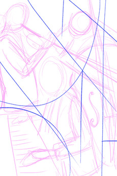
I started with 2 different layouts, the blue lines represent the cubism style similar to Keith. The image on the left ticked all the boxes as far as energy was concerned, so I decided to expand on this.

In the end I decided to crop the illustration to be focused on the man playing piano. It felt like the strongest part of the picture, plus I really struggled on getting the other characters in. I quickly placed this in a poster format and added some text. I pinched colours from the illustration to help create this poster.

I wasn't bowled over by this and in the end but pleased to have experimented.
Existing Posters for Jazz
So as the exercise is to create an illustration for a poster, I needed to create mood-boards. I wanted to focus on Jazz posters just so I could get an understanding of what people were already putting out in the world. I noticed a few repeating themes through out this search which is exactly what you would expect for an event full of chaotic noise jamming together.
Here was some of my favourites:

Lines are wobbly, colours are bright, some are abstract and some are graphic. In all, every poster captured the essence of Jazz, literally or with clever design.
Illustrations on Jazz
Just to explore some more styles I pulled together my favourite illustrations based on jazz music and stuck them on a moodboard. I love the quirkiness to these images and the composition is really strong. The could be easily placed in a poster without any trouble!

Jazz Energy
Can't do all this work without actual jazz reference! I wanted get a taste for the poses when playing the instruments to the energy or the live experience.

POSTER RESEARCH
Plakaty - Henryk Tomaszewski
Graphic, 500 Designs That Matter - Phaidon
I had already been heavily influenced by the exercise "Abstract Illustration" at this point, and having picked on the theme of Jazz for that, I decided to combine the two together. I mostly experimented with the paintings that was produced in this exercise, bumped the colours up in Photoshop, cleaned them up and and added text. I REALLY enjoyed doing this and think they came out better than expected.


I LOVE THEM ALL! I'm so pleased with how I was able to use the paintings from the previous exercise and really push the text layout. It's hard to pick one, but I do like the yellow background and the blue red with jazz title over-layered (above). They feel retro, but modern!
REFERENCE


Comments