Creating your own Version of Reality
Look through as many different illustrators’ sketchbooks that you find interesting.
• Consider the various ways that other illustrators respond to figures and environments.
• What materials do they use?•
Do they sketch quickly or are the drawings more sustained?
• If they draw fast how is this achieved- how is the content edited ?
• Which subjects or parts of the images are edited or stylised?
• How does the stylisation affect the communication process and the sense of documentary?
• Are there any parts of the images that are unfinished and what impact does this have on
the overall image?
• Are there some images that you think communicate better when drawn slowly?
I looked through several sketchbooks on the website provided, and only found 1 or 2 that I thought related to the topic in this part of the course. There were several artist sketchbooks and works I enjoyed, however for the purpose of this exercise and the ones that came before, I focused in on the artist Lauren Nassef. Much of her works seemed to have focused on observational drawing, such as studying people and delicate drawings of objects.
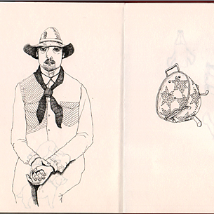
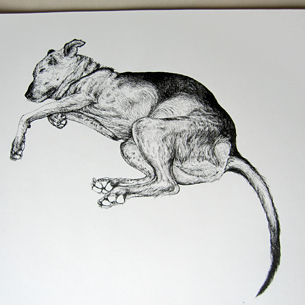
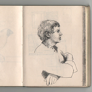
the examples shown on the website consist of beautiful studies in both ink and pencil. It looks as thought Lauren enjoys using fine liners for the ultra fine line work that she creates. The image of the dog in contrast to the others shown above is a highly rendered study with incredible detail achieved by using a very fine pen. The image of the male profile bottom is drawn in pencil, looking realistic and accurate in proportion, this looks like it might have been a study done in a good amount of time.
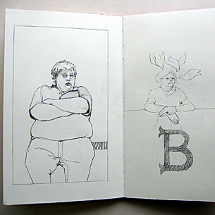
I like how Lauren almost leaves the environment out of the illustration, only focusing on the subject matter. Only the image on the top right indicates a little hint of an environment, or at least a place, I.e sitting on a wall or leaning on a table. Returning to the image of the dog, Lauren captures a lifelike illustration, yet leave the background pure white and entirely flat, no shadows are included, and nor do they need to be. It is so well done that you can see the floor that doesn't exist because of the angle in which she has drawn it.
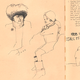
The image that is bottom row middle, with two half drawn women looks to be the drawings that have been done in the least amount of time. They're very unfinished in comparison to the other pages. Otherwise, Lauren's work in these pages definitely feel to be more sustained, developed drawings that perhaps she had returned to at a later stage to add more definition.
I would consider the top three images to be mostly stylised illustrations, whilst the others are quite observational and realistic. The characters on the left top row both feel to belong on the same page, although very different in the appearance and characteristics. The delicate line work and the colouring in are very much similar. I like how in the middle image, Lauren has almost created a narrative by selecting the object that sits opposite the gentleman in quite an interesting outfit. In a way it tells a story, as if the man makes the object on the right, or has some bizarre connection to it.
Who's to know if the images are unfinished, in a sketchbook anything goes and if the artist decided to leave it where it is then I guess it is finished even if it doesn't look to be. That said, I feel the most unfinished looking piece would be the bottom middle page. When comparing this to the top row, I wonder if Lauren would have liked to have added more to the lady on the right, or if this was a conscious decision to leave as it is. My feelings suggest that it was started when in a cafe, but the lady had left before finishing.
In the selected collection above, I think the image bottom right and left show what drawing slowly can achieve. Bottom right looks to be a study, and time appears to have been spent on achieving a realistic observation. The shading looks to be applied fast, yet the the decision making in applying the shade, and committing to adding darker areas would have made this a slow sketch. The dog on the other hand, even the shading I think looks intricate and slow.
LINKS
https://laurennassef.com/ 11/04/21 20:18






ความคิดเห็น