Research 4.1
- Here's Helen
- Jun 17, 2021
- 5 min read
Top Ten Visual Diaries
Bryce Wymer
I admire Bryce sketchbooks for the style element. I like the design aesthetic of his works as well as the detailed studies that are mixed within the pages of his books. An artist that I had included in the first part of the Sketchbook journey, for which I appreciated the way he uses the space within his sketchbook. They appear to be books of finished pieces, a visual diary of his thoughts, and ideas, and certainly a space for exploring conceptual art.
• What are the visual qualities of the journals?
Rendered ideas that almost feel like final artworks. A playground for visual design. Rich in content, ideas and colours.
• What kind of content and ideas are explored?
I would say the human form, and perhaps the way in which it fits within a space. Many of his works within the sketchbook appears to explore the space, connection, shape and form. Some feel disconnected, and surreal with abstraction.
"His personal works address human social progression and the driving relation between the powerful and the powerless."
The use of the boxed limitation of a page in the sketchbook, or a double spread works very well with achieving the ideas surrounding human relations. I think this is where I get the sense that Bryce explores space which can often give a visual understanding in the emotion. How he fills the space with an awkwardly bent form which is inaccurate to the realities of human anatomy in how they bend, can lend to the idea that it is imprisoned, restricted, limited in its freedoms or its mental stability. Bryce appears to use the page as part of the overall idea, often going edge to edge almost with shapes and forms. Design really feels to be a strong element in Bryce process.
• How does the visual quality and content help establish the creative identity of the maker?
The quality in the visual ideas explored in Bryce sketchbooks are very stylised illustrations that are clearly identifiable of his work. From the style of the human figure to the colours in which he uses. Though the sketchbooks look to be final works rather than initial ideas or observations, you can get a sense of the way he explores concepts that would be seen in his portfolio of published works.
• Do these journals help to make connections with these artists’ wider work?
Yes I believe they do. As mentioned above, despite the sketchbooks looking like final works that can be in a gallery, the richness of the content and visual design of the works, to the point that each page seem to have had a plan from the beginning, they all build connections to the wider works of Bryce.
Oliver Jeffers

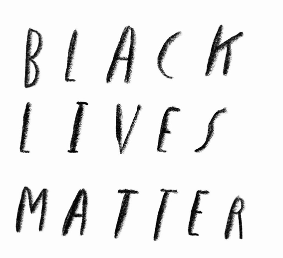
I've been a fan of Oliver's children books for quite some time now, ever since discovering the incredible story, "The Day the Crayons Quit" and then the brilliant title for when they return. The idea is brilliant, so relatable and truly accurate to a point the adults can enjoy reading it with a chuckle and a nod for each page! If it isn't the illustrations, then the most distinct aspect to his works is the handwritten typography. It's almost, dare I say, iconic to his work. Without seeing his name on a book, the font alone will be recognisable, so it is great to see that it isn't just limited to the children books, but in fact across his portfolio, and in sketchbooks you will find elements of the writing style as well.
I guess the font is so powerful and iconic, that the simple BLACK LIVES MATTER image need nothing more.
• What are the visual qualities of the journals?
With one sketchbook available to view on Oliver Jeffers website, the answers to these questions are of one observation, rather than a comparison across several. With that said, the few pages that have been shared is almost what one would expect to see when familiar to Oliver's work. There are delicate illustrations, illustrations where space is a factor, there is collage and textures with simple illustrations to accompany them, and more. I feel a sense of wonder, fascination and playfulness in his sketchbook.
• What kind of content and ideas are explored?
What is interesting is the sketchbook feels editorial, like exploring ideas based on headlines or metaphors. You can see familiar characters or topics within some of the pages which have made the way to final published works. Ideas based on environment, storytelling and human behaviour.
Curiosity and humour are underlying themes throughout Oliver's practice as an artist and storyteller. While investigating the ways the human mind understands its world, his work also functions as comic relief in the face of futility. - https://www.oliverjeffers.com/about
• How does the visual quality and content help establish the creative identity of the maker?
The pages aren't bursting with illustrations or information, they are quite minimalist on that part. This, in my opinion, makes the book strongly identifiable as works by Oliver Jeffers. The exploration throughout the book doesn't stray too far away from the works you see in his portfolio, the style is distinct to him. The subject throughout also play true to the themes in which Oliver explores in his wider work.
• Do these journals help to make connections with these artists’ wider work?
Absolutely! The style in which he draws the human, the titles given to each piece, or a simple comment to summaries, to put matter of factly. The humour that is there, and the flash of insight to the early workings of bigger ideas. It's just one look into one book, yet the connections I feel are strong. The work is consistent yet varied.

Laurent Moreau
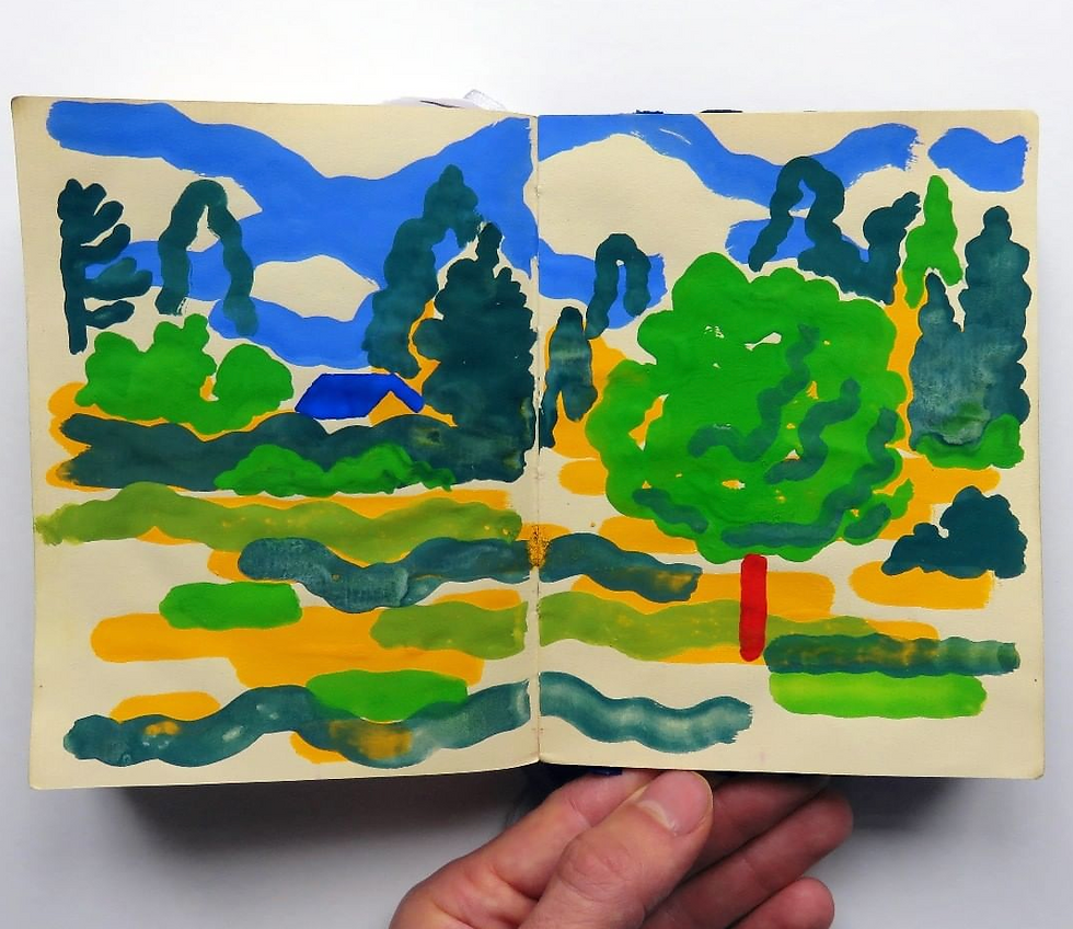
Consistent in his chosen medium, Laurent works with mostly gouache paints, covering themes of landscapes, and people within his sketchbooks.
What draws me to his works is the style in which he captures the world around him mixed with imaginative illustrations of how he sees it.
• What are the visual qualities of the journals?
Consistent, imaginative, thoughtful, colourful.
• What kind of content and ideas are explored?
Landscapes and people
Moreau draws what he sees around him. Landscapes, the sky, and nature inspire him to fill sketchbook after sketchbook. https://paperdartsmagazine.com/art-archive/2017/12/7/laurent-moreau
• How does the visual quality and content help establish the creative identity of the maker?
I would consider the content to be rich in the idea generation for potential editorial subjects. Comparing the sketchbook to the finished works, the simplistic style in the way he draws people, and the application of the paint are all qualities I would identify as Laurent's style.
• Do these journals help to make connections with these artists’ wider work?
Much of the content Laurent creates is done with Gouache paint. The colours are blocked, perhaps an experiment of how colours behave when overlapped, much like the effects achieved with Riso printing, or simply overlapping shape and using the multiply tool in Photoshop. Laurent very rarely blends colours, and in the sketchbooks this is also evident. There is a design element in the way he works, both in final work and sketchbook. Sketchbooks are clean much like the final piece. I feel a real connection when looking at both areas of his work, it is true to his style.

Pat Perry
Gary Baseman
Margaret Huber
Fabio Consoli
JooHee Yoon
Links
https://www.youtube.com/watch?v=JWG9M8I2A3Y 19.04.21 - 20:25
https://www.aflatearth.com/new-index-1#/sketchbooks-15/ - 19.04.21 - 21:14
https://www.oliverjeffers.com/selected-drawings-and-collages - 25/04/21 - 21:02
https://www.oliverjeffers.com/about - 25/04/21 - 21:18
https://www.oliverjeffers.com/blm - 25/04/21 - 21:29
https://paperdartsmagazine.com/art-archive/2017/12/7/laurent-moreau 27/04/21 - 19:37
https://garance-illustration.com/laurent-moreau/ - 26/05/21 - 08:19
http://www.laurentmoreau.fr/ 26/05/21 - 08:40
https://paperdartsmagazine.com/art-archive/featured-artist-pat-perry.html?rq=sketchbook - 27/04/21 - 19:44
https://www.youtube.com/watch?v=0BNW48Peanw 27/04/21 - 20:48
https://www.garybaseman.com/work/global-events/ 22/05/21 - 15:43
http://www.margarethuber.com/visual-diary.html 22/04/21 - 16:32
http://www.fabioconsoli.com/about/ 24/05/21 - 08:45
https://www.aflatearth.com/new-index-1#/sketchbooks-15/ 24/05/21 - 09:25
https://www.jooheeyoon.com/ 26/05/21 - 08:23
http://inkygoodness.com/features/1038/ 26/05/21 - 08:27
https://jooheeyoon.tumblr.com/ 26/05/21 - 08:32


Comments